
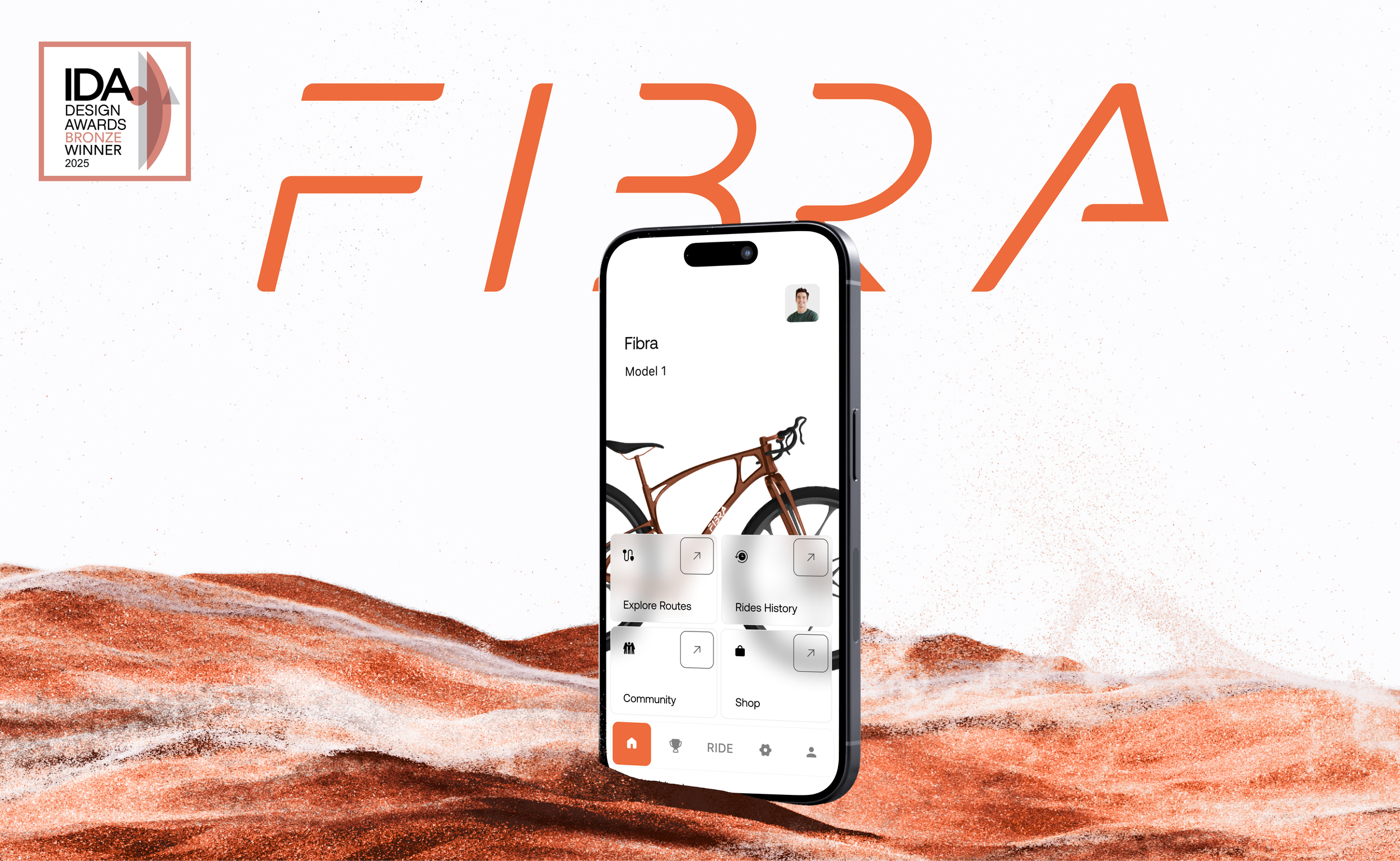
Fibra Cycling App: Designing Mindful Movement
An outdoor movement app designed to support intentional, nature-connected lifestyles. Paired with the Fibra bike, it helps users discover scenic routes, track progress, and stay motivated through simple features, social tools, and rewarding routines.
Role
Ux Designer, Researcher
Date & Duration
2025, made in 10 weeks
Type
Individual
Problem
As digital engagement grows, people are becoming increasingly disconnected from their bodies and the natural world. Sedentary routines and screen-driven habits contribute to physical stagnation and a loss of meaningful outdoor experiences.
Fibra is a movement-focused app that encourages small, rewarding outdoor experiences through intuitive design and seamless bike integration. Blending soft adventure with digital wellness, it supports a natural return to physical activity without pressure or disruption.
Solution
Audience Insights
Nature lovers and outdoor enthusiasts seeking an exciting, low-effort way to enhance their hiking experiences.
Adventurous Spirit
Active individuals who want a smooth, time-saving descent without sacrificing the thrill or beauty of the trail.
Effortless Transition
Users who value gear that’s compact, durable, and easy to carry — designed to fit into their routines without added weight or hassle.
Smart Portability
Research
50/100%
Hike moderately — once every few months — showing steady outdoor interest.
25/100%
Need motivation and smart support to make physical activity feel achievable and rewarding.
63/100%
Prefer guided routes over searching for locations, favoring convenience and curation.
88/100%
Would use an app to track hikes and rides, indicating strong interest in digital tools for outdoor activity.

Design Pillars
Fosters lasting motivation through shared progress and support.
Community Building
Route Awareness
Supports self-paced journeys by clearly labeling route difficulty—empowering users to choose what feels right for them each day.
Custom Experience
Strengthens user commitment by offering meaningful choices during bike purchase.
Rewards System
Encourages consistency with points that accumulate toward future accessories.


Usability Testing
Route selection & start flow
Points & rewards experience
Community & shop navigation, bike customization
Difficulty level display
Tested with 12 users
Flows tested:
Evaluate ease of navigation
Understand user perception of difficulty levels
Gauge clarity and value of the points system
Testing Objectives:

Results:
11/12
Successfully completed core flows: ride start, shop, and community.
5/12
Didn’t think of the customize button as clickable, but inferred its function.
9/12
Found difficulty levels unclear.
6/12
Clearly understood the points system.
Site Map

Typography & Color


Heading: 28pt
Title: 18pt
Body: 14pt
Process
This project gave me full ownership and responsibility for a product. The process started with defining the overall direction of the experience, since both the bike and the app began from an open floor with no predefined visual or interaction language. That early phase focused on aligning on what the product should feel like and who it was for before narrowing decisions down.
I designed the app end to end while working alongside an industrial designer who focused on the bike itself. Once the direction was established, my focus shifted to the technical structure of the app. I prioritized flows, logic, and edge cases before moving into styling. Visual design came later, built on top of a clear and stable foundation rather than driving decisions upfront.
A key part of my process was stepping outside my own perspective and removing personal bias. Alongside formal usability testing, I constantly ran small, informal check-ins by showing work to designers around me who had no connection to the project. Simple questions like “What does this feel like?” or “What would you associate this with?” helped me quickly sense whether the experience communicated what it was meant to, without over-explaining it. These frequent reality checks helped validate the structure and tone early and often. Formal usability testing later confirmed that the core logic and flows were working as intended, while helping refine clarity in specific areas.
Another important aspect of the process was communication. My initial visual instinct leaned more electric and modern, while the physical product leaned more natural and grounded. Aligning those directions required clear reasoning, iteration, and openness to adjustment. Overall, this project strengthened how I move from open exploration into structure, validation, and refinement while keeping the experience cohesive.


