Nest Thermostat: Promoting Sustainable Living
A UI-focused redesign of the Google Nest Thermostat tailored to eco-conscious minimalists. The project explores how subtle interface enhancements can align with sustainable, simple lifestyles while offering intuitive, supportive climate control.
Role
Date & Duration
UX & UI Designer
2024, made in 10 weeks
Type
Individual
Case Study
Google Nest

As smart home products become more advanced, their interfaces often prioritize capability over clarity, leaving specific audiences underserved. For eco-conscious minimalists, existing thermostats can feel overly complex, visually intrusive, or disconnected from their values of simplicity and presence. The challenge lies in creating a more intuitive and quiet interface — one that respects their desire for mindful living and physical comfort without adding digital noise.
Problem
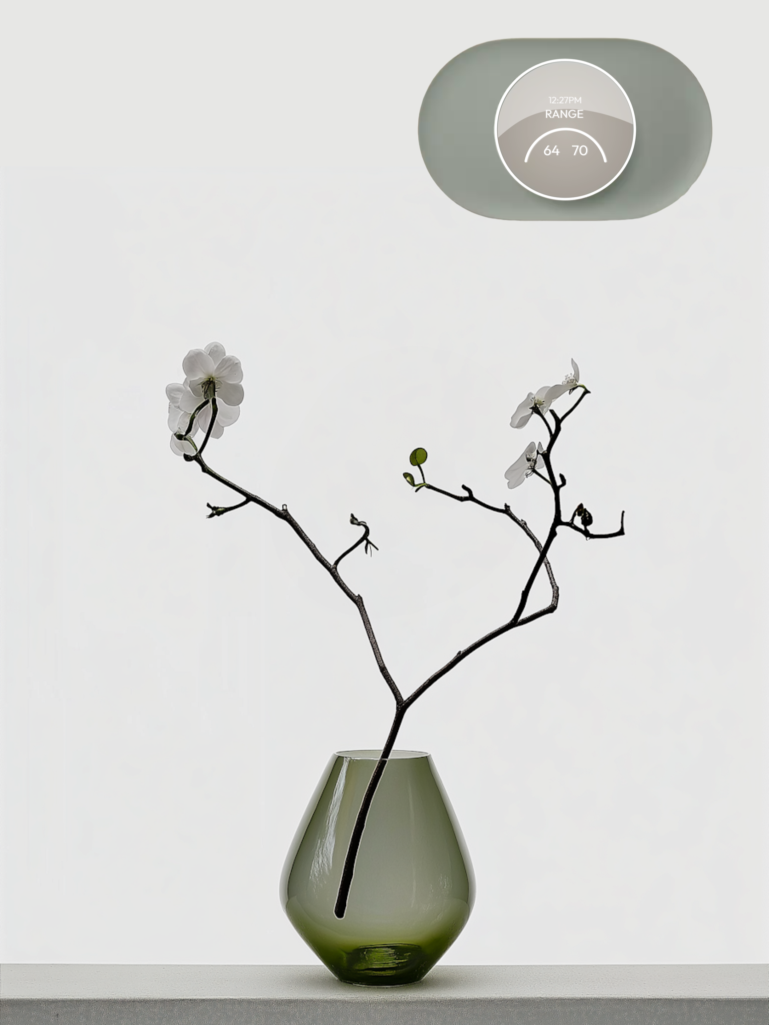
This redesign explores the thermostat through the values of eco-conscious minimalists, reframing control as a quiet, supportive presence rather than a constant demand for attention. Guided by principles of clarity, restraint, and calm feedback, the interface emphasizes essential functions while softening its visual and cognitive footprint. The result is a system that preserves comfort and awareness without adding digital noise — aligning with mindful living.
Solution
Audience Insights
Eco-Conscious Minimalists
Simplicity & Sustainability
Value straightforward, sustainable choices that reduce waste and clutter.
Durability & Functionality
Prioritize long-lasting products made from natural, eco-friendly materials.

Gives preference to peaceful and organized spaces , reflecting responsible life choices.
Mindful Living

Visual Language & Design Pillars
1. Subtle Clarity
Interfaces should feel lucid and non-intrusive—clear when needed, invisible when not. Simplicity is not emptiness, but intentional restraint.
2. Atmospheric Neutrality
A monochromatic and demure palette blends into the home, not over it. The UI becomes part of the atmosphere, not a focal point.
3. Natural Restraint
Design choices are grounded, reflecting a respect for natural materials and tones. Form follows intention, not attention.
4. Quiet Confidence
While not loud or assertive, the interface offers strength in presence — stable, predictable, and thoughtfully crafted to support comfort without interruption.

Usability Testing
Evaluate design clarity
Test functionality and usability of features
Assess iconography, text size, and proportions
Check color contrast and energy feedback efficiency
Tested with 10 users: 8 Nest users; 2 Non-Nest users
Testing Objectives:

Task Completion – Primary Actions
100/100%
Change the current temperature
100/100%
Turn modes on/off
100/100%
Identify the “Energy Consumption” feature
100/100%
Identify the “Temperature Range” feature
42/100%
Identify the “My Schedule” feature
1. All participants described the UI as “calm” and “simple”, affirming that the design tone aligns with our target audience.
Key Insights
2. Participants expressed the need for clearer instructions or microcopy on how features function.
3. There was a lack of clarity in content-heavy screens such as My Schedule and Energy Consumption.
4. Participants noted a disconnect between icons/visuals and their related text, impacting comprehension.
5. A desire for greater visual cohesion across screens was commonly voiced.
Changes
Home Screen: My Schedule Feature

Solution:
Improved placement, grouped with related features, and added a supporting label
Issue:
Low visibility and unclear relevance to thermostat use
My Schedule Screen
Issue:
Low comprehension due to small text and unclear information hierarchy
Solution:
Improved text size, clarified data relationships, and aligned layout with other screens for cohesion

Issue:
Low contrast, small text, and unclear hierarchy made key data hard to interpret
Energy Dashboard Screen
Solution:
Introduced a new color scheme, increased text size, and emphasized key metrics with clarified iconography

Issue:
Unclear information, small text, and lack of supporting details
My Schedule Thermostat Screen

Solution:
Aligned with mobile version, increased text size, and added contextual information for clarity

Wireframes

Process
The undiscovered fruit in my UX journey, this project challenged me to work on a thermostat interface for the first time. The process began with physical context. Once I held the device in my hands and realized its true scale, the constraints became immediately clear. For the interface to succeed, accessibility had to come first. That realization ruled out ideas right away. Thin lines, airy visuals, and overly delicate UI treatments were simply not going to hold up or be usable at this size.
From there, my attention moved to what actually deserves space on the thermostat screen. With so little room, it can only carry a few elements at once, never the full system, so hierarchy and relevance became non-negotiable. I went deeper into research and tabulation as a way to step outside my own head. It helped me unpack the feeling I expected from the product and turn that into concrete adjectives, which then started to shape the visual direction. It felt like a practical way to let the design emerge, rather than forcing it.
The next challenge was working across two connected surfaces: the thermostat itself and the mobile app. I had to be intentional about what belongs where and how the experience carries across both without feeling duplicated or fragmented. I was careful not to fall into obvious “green” or eco-coded visuals. Usability testing ran throughout and was especially validating when it came to scale and proportions. The results confirmed that the adjustments improved clarity and balance. Overall, this project sharpened how I think about constraints, scale, and how early physical realities shape every design decision that follows.