Erewhon — Improving Self-Order Kiosk Usability
Erewhon, a premium grocery retailer, explored a self-order kiosk to support customer ordering and reduce wait times within its in-store experience. This project focused on evaluating how the kiosk should function within the in-store environment.
ABOUT
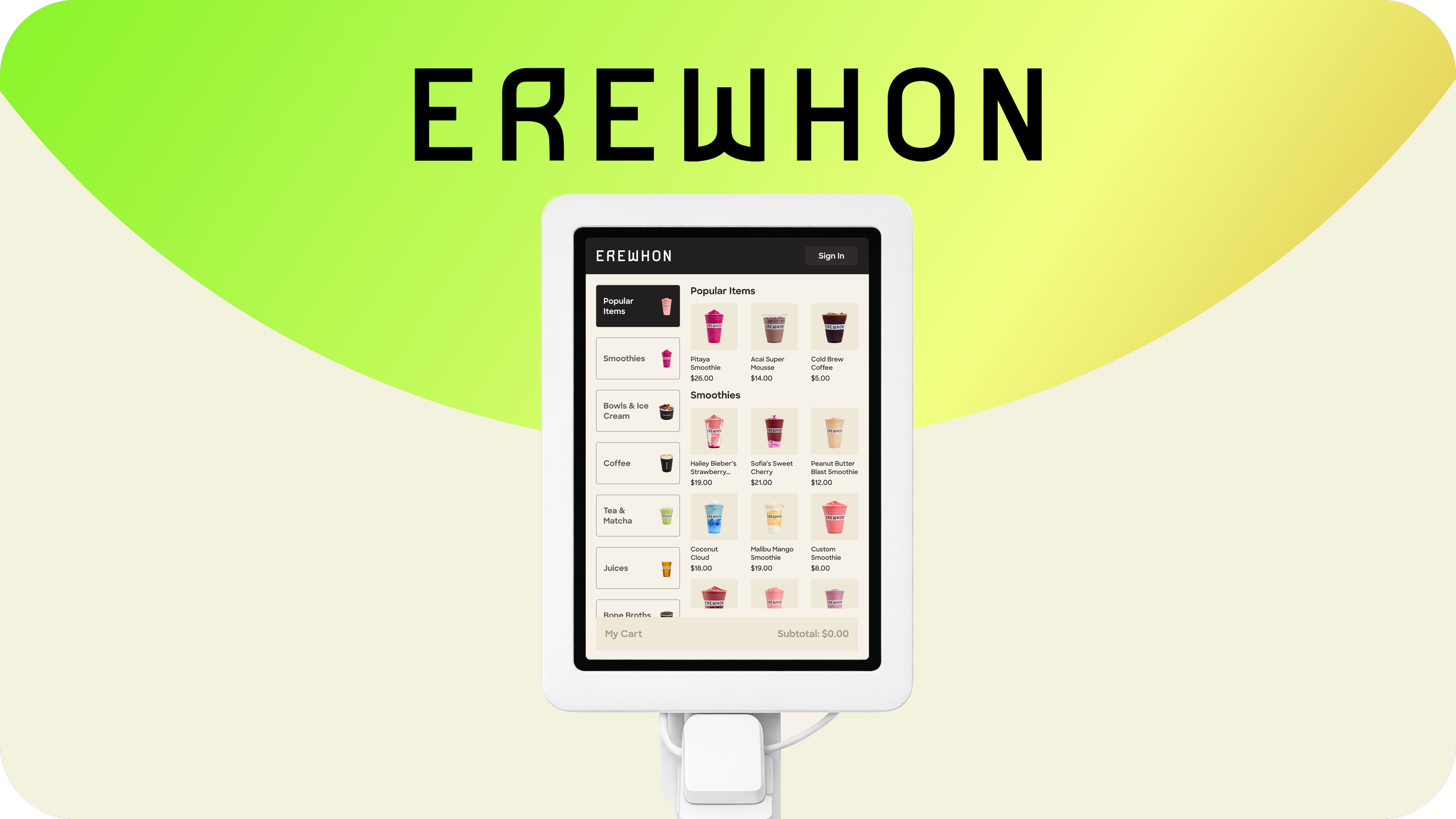
Platform
Kiosk
Duration
10 weeks
Role
UX Researcher
Team
Individual
Define the optimal kiosk setup and evaluate prototype usability in a real retail context
Problem
Delivered production-ready hardware configurations, tested the initial prototype and proposed usability-driven refinements
Outcomes
EARLY RESEARCH
I began with secondary research to understand the core functionality of self-ordering kiosks. This informed first-hand diary studies of direct and indirect competitors and revealed the need to evaluate the kiosk’s accessibility in a real retail context. Guided by ADA accessibility standards, I then defined the screen and card reader configurations used for usability testing.
ERGONOMICS & ACCESSIBILITY
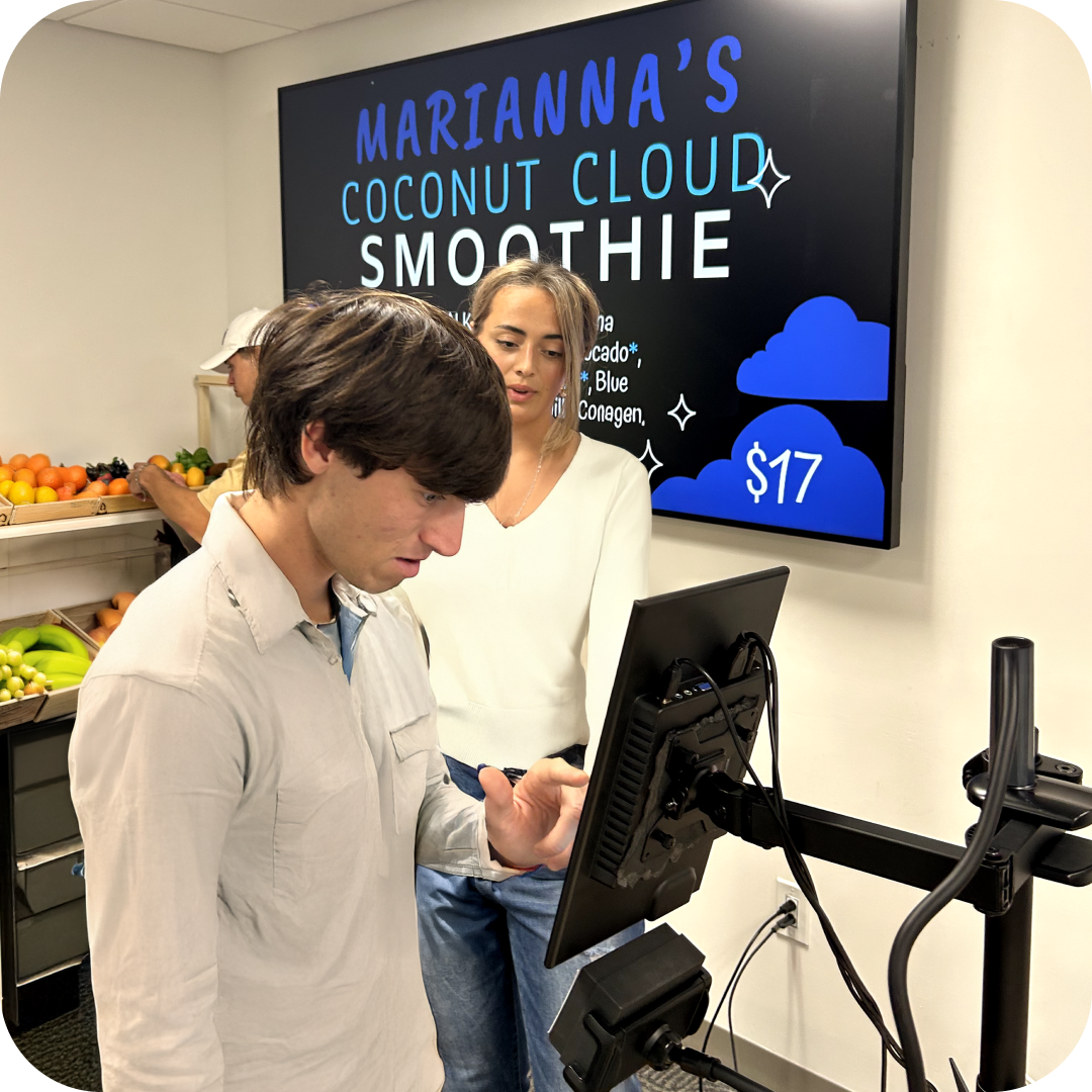
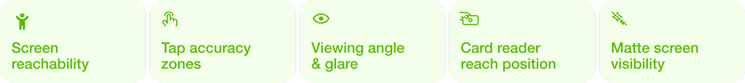
Ergonomics testing was conducted in a usability testing room on a real kiosk hardware with 14 in-person participants (participants height range: 4′11″–6′2). This phase focused primarily on physical interaction with the kiosk with the focus on five core pillars.
RESULTS
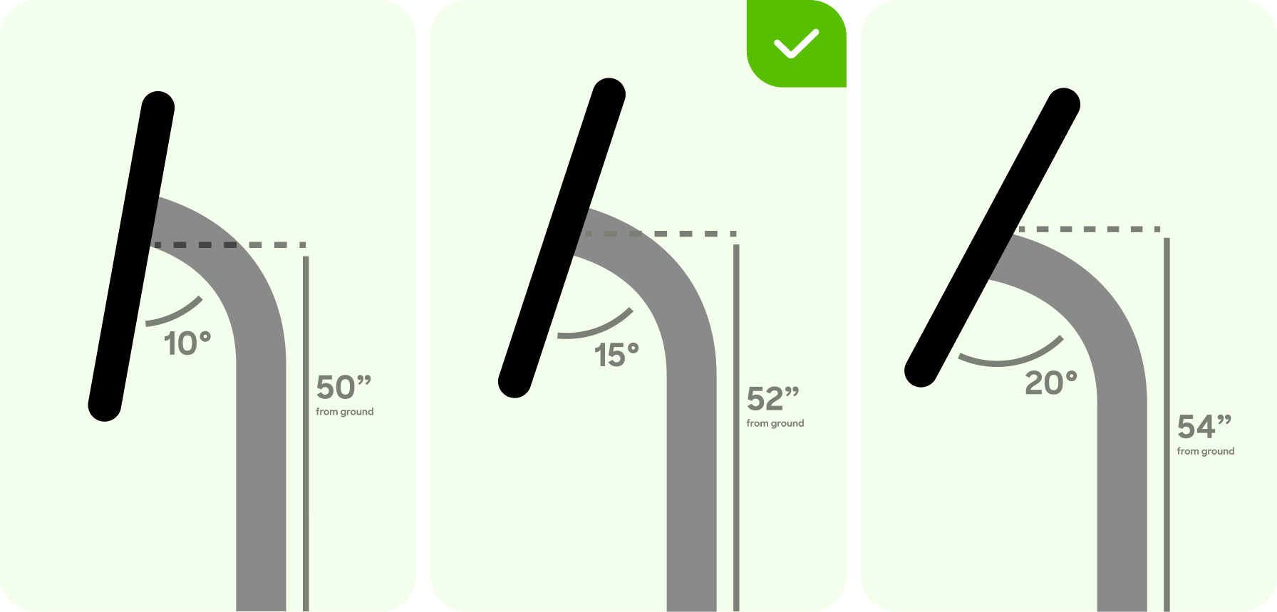
38% of participants preferred kiosk setup at 52″ height with a 15° screen angle
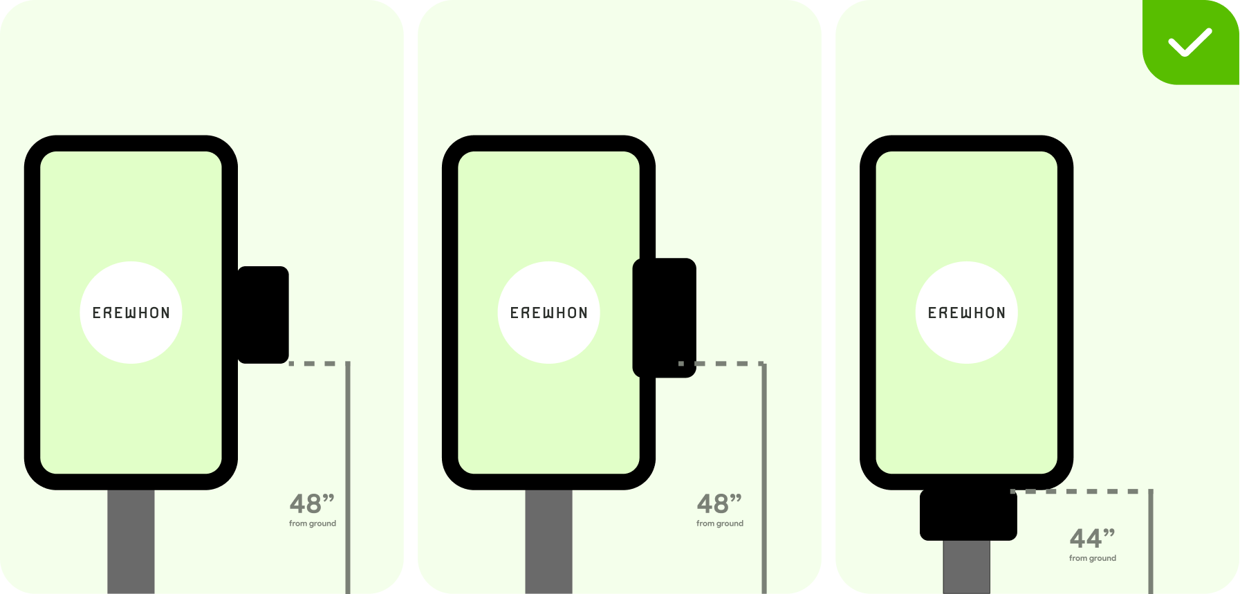
39% of participants stated the most accessible card reader position at 44″ height, placed under the screen
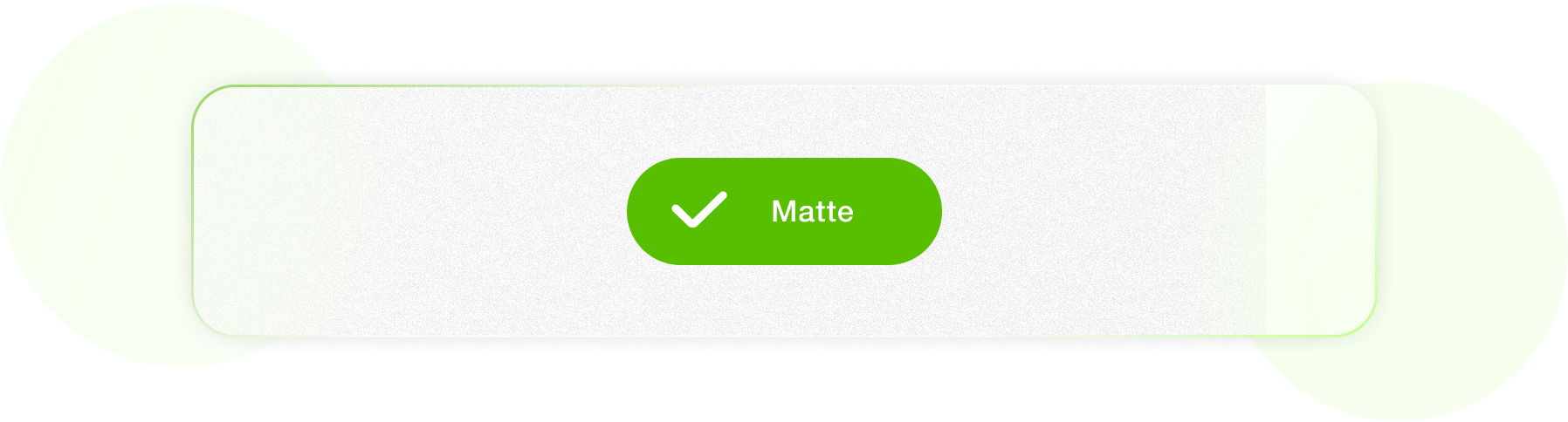
83% of participants preferred a matte screen finish, citing reduced glare and clearer visibility
PROTOTYPE TESTING
Ergonomics testing defined the physical configuration of the kiosk for further prototype evaluation. Environmental setup was followed to reflect Erewhon’s real in-store experience.
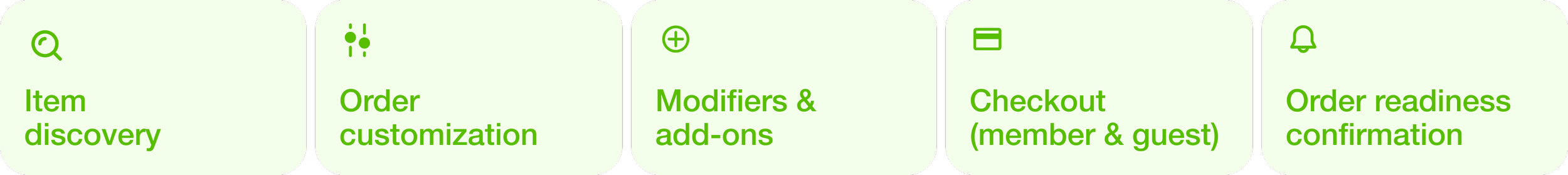
The testing included 18 participants (13 in person and 5 remote via Maze, a usability testing platform). Five primary flows were evaluated, defining the functionality of the current prototype and informing potential refinements.
FINDINGS
DESIGN RESPONSE
After identifying the main usability gaps, I addressed them through brand aligned UI updates focused on minimal changes.
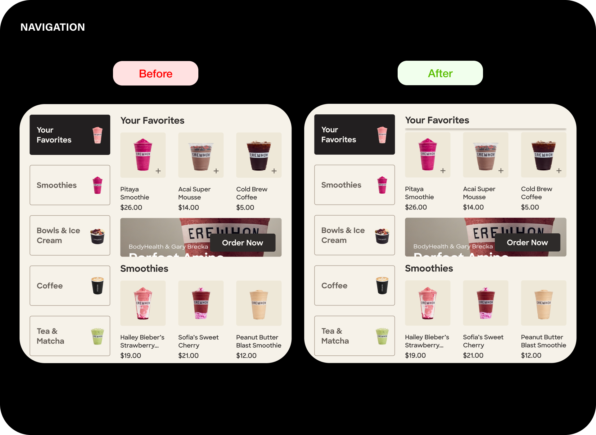
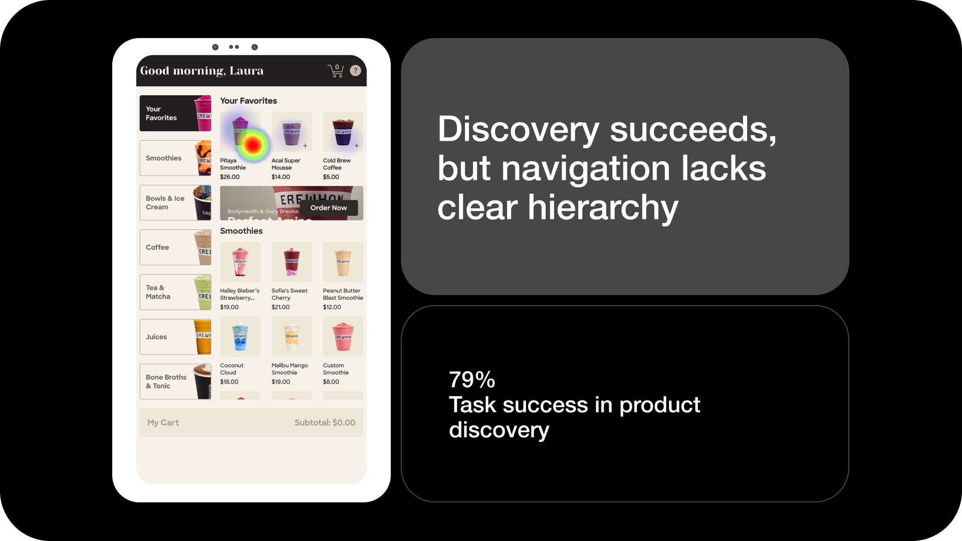
Users did not understand the relationship between the menu sections on the left and the product content on the right.
Sticky subcategory names were added to make the relationship among them clearer
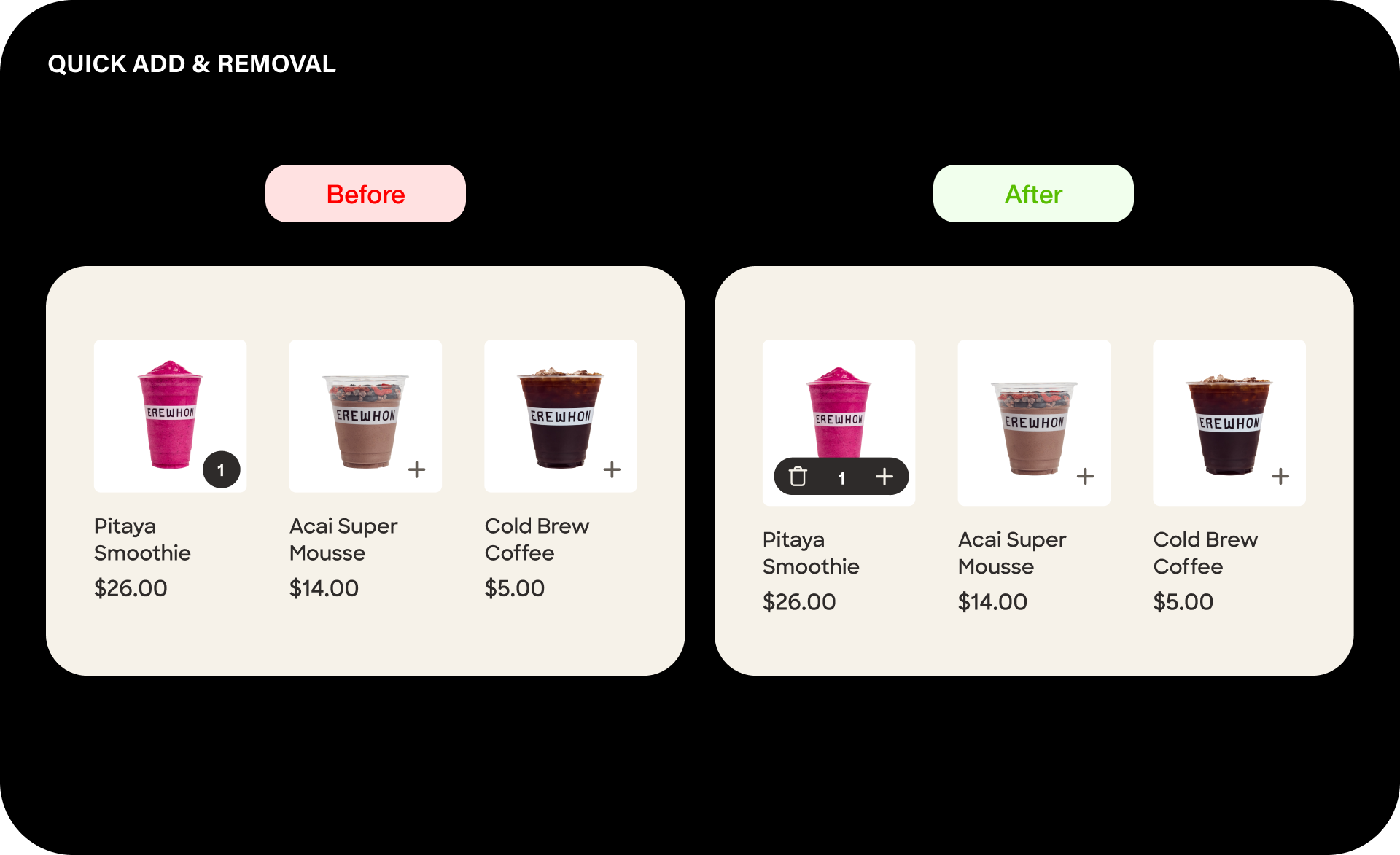
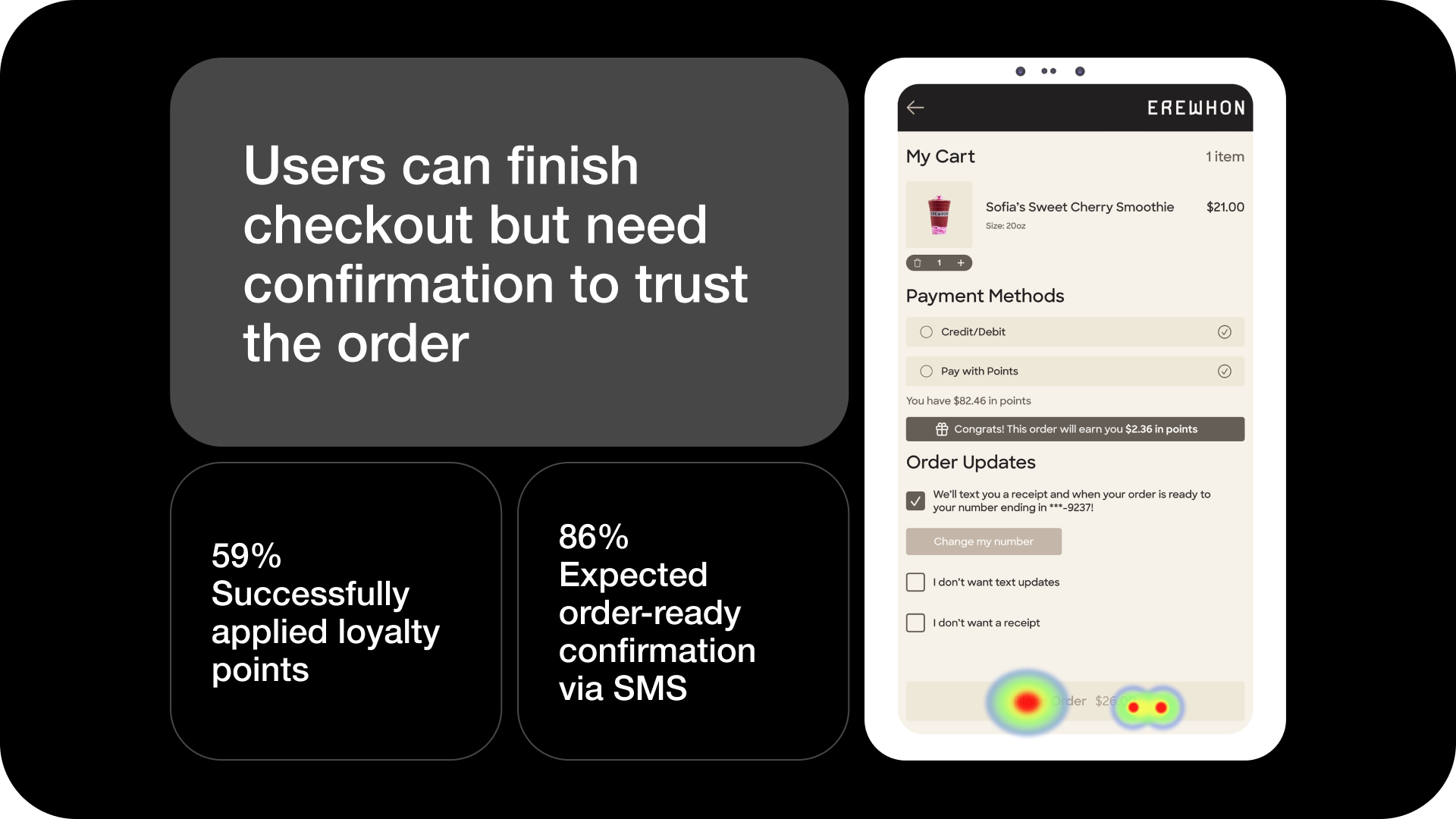
Users added products from the menu using quick add, but could only remove them from cart.
Quick remove feature allowed removal directly from the item card
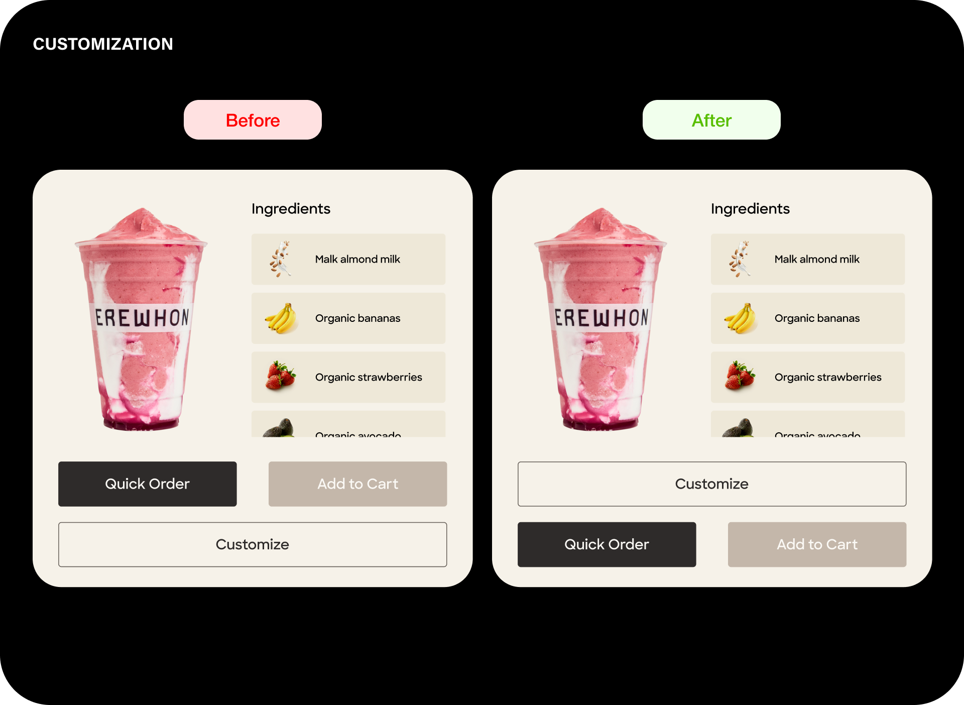
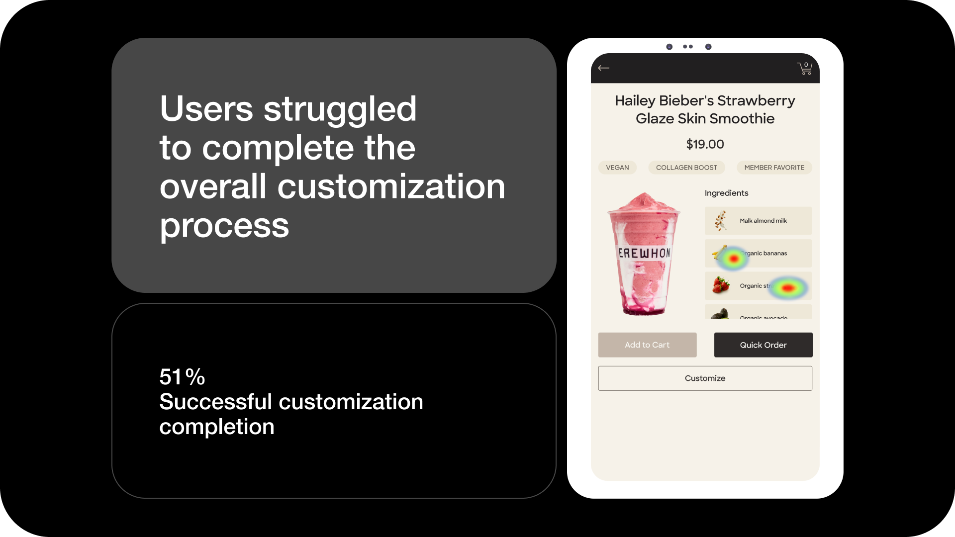
Smoothies are one of Erewhon’s signature products and are a common ordering choice.
Users missed the customization button, so it was moved above the checkout button
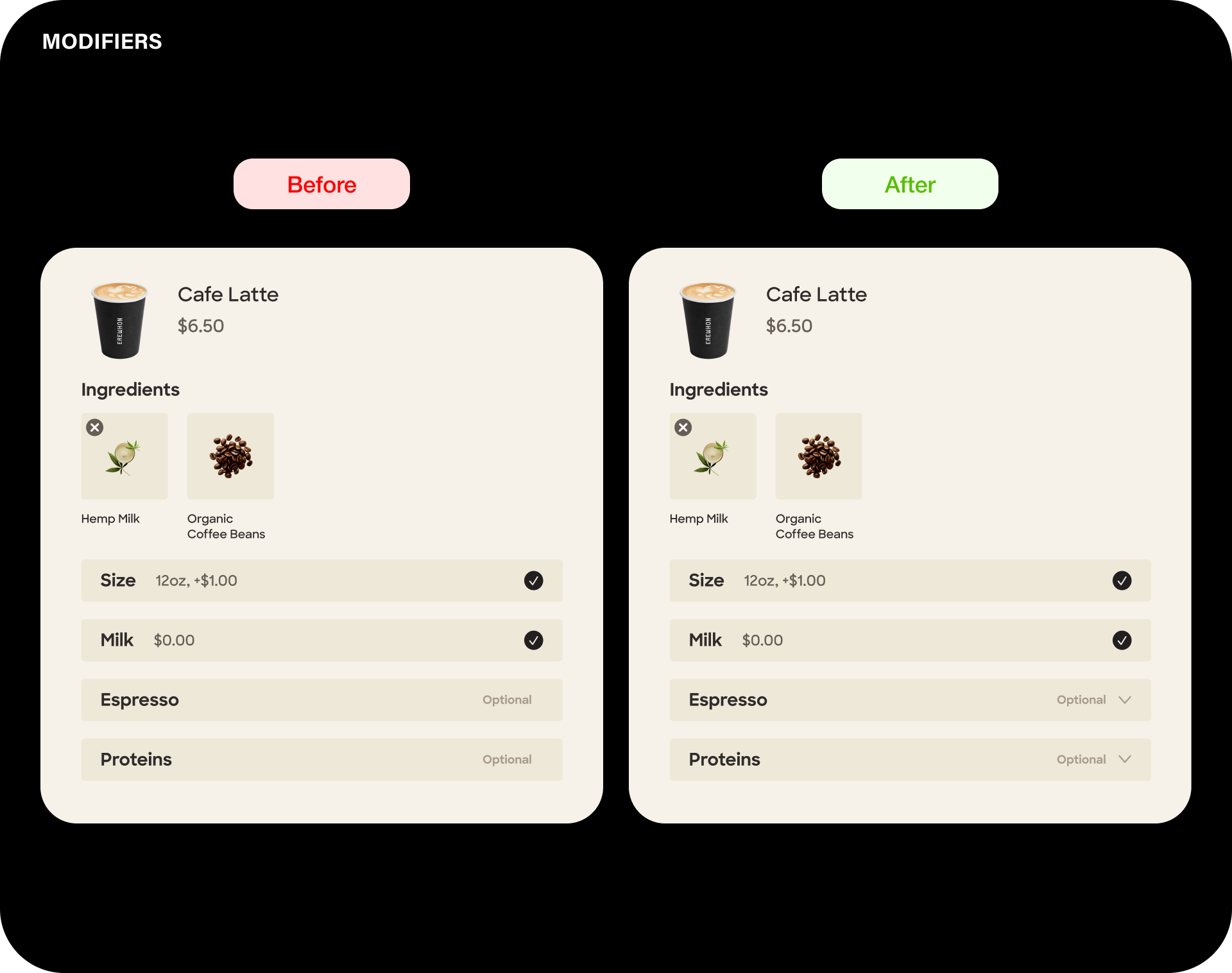
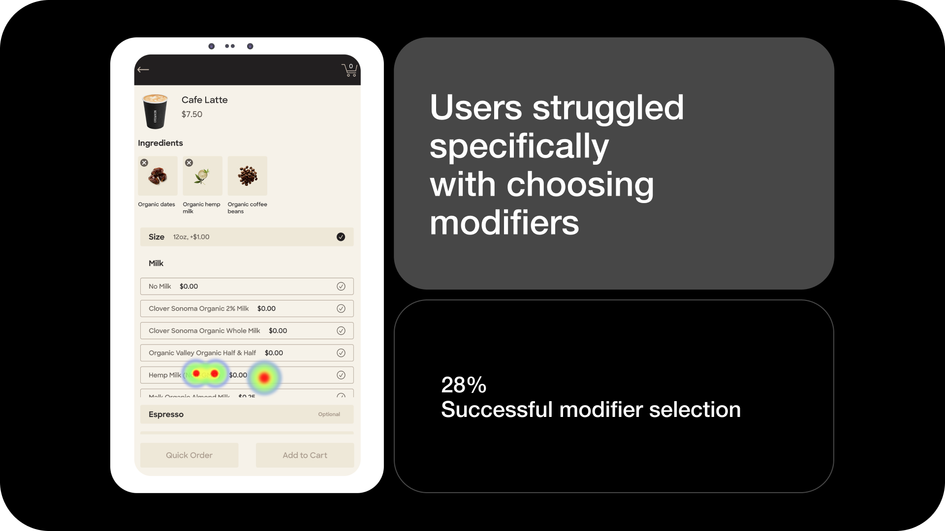
Erewhon products offer multiple modifiers to support the brand’s focus on personalized choice.
Users did not understand how to access these modifiers, so dropdown indicators were added
IMPACT
Informed early product direction
Findings, usability insights, and design refinements were presented to Erewhon stakeholders. This work supported early decision-making and provided a validated foundation for subsequent internal iterations and improvements.
Image Reference: Jake Sefane
LEARNINGS
✅ Accessibility shapes the entire experience
I learned how inclusive design decisions directly impact usability, brand perception, and overall customer trust within a retail environment.
✅ Neutral moderators reveals real behavior
Running usability sessions strengthened my ability to communicate clearly, stay unbiased as a moderator, and observe genuine user interaction instead of guiding outcomes.
⏩ If I had more time…
I would conduct a second testing round with a more targeted audience to validate the proposed design solutions.