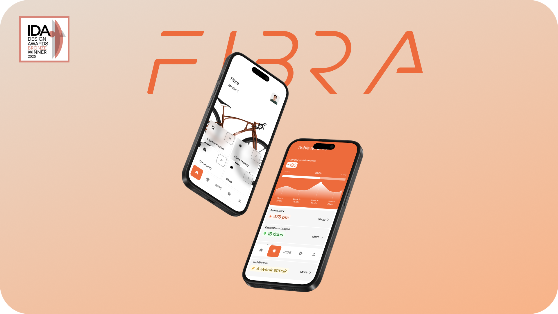
Fibra App — Supporting Long-Term Cycling Habits
Fibra is a mobile companion app created for non-professional cyclists who want to integrate outdoor riding into their regular routines. This project explored how product guidance, expectation awareness, and structured ride planning can make outdoor cycling feel more approachable and repeatable over time.
ABOUT
Platform
Mobile App
Duration
10 weeks
Role
Product Designer
Team
Individual
Preparation effort and uncertainty about route demands prevent riders from maintaining consistent cycling habits
Problem
Delivered and tested an end-to-end interactive prototype, validating the product narrative
Outcomes
EARLY RESEARCH
I began by exploring why non-professional riders struggle to spend consistent time outdoors despite clearly understanding its benefits. This phase combined secondary research, surveys, interviews, and competitive review to identify where motivation breaks down before action. I established five core dimensions to frame the research around to better understand the user behavior and reasoning.
SURVEY & INTERVIEWS
I ran a survey with 14 participants and followed up with 3 one-on-one interviews to go deeper.
Together, the research showed the same gap: interest is high, but planning and readiness expectations break right before the first attempt.
COMPETITIVE LANDSCAPE
To understand how outdoor activity is currently supported, I analyzed platforms focused on planning and tracking participation. Strava and AllTrails clarified the landscape: strong support for performance and navigation, but limited support for readiness before starting.
DESIGN PRINCIPLES
Bringing together the research findings the gap between wanting to go outside and actually starting I synthesized into three core design principles for Fibra.

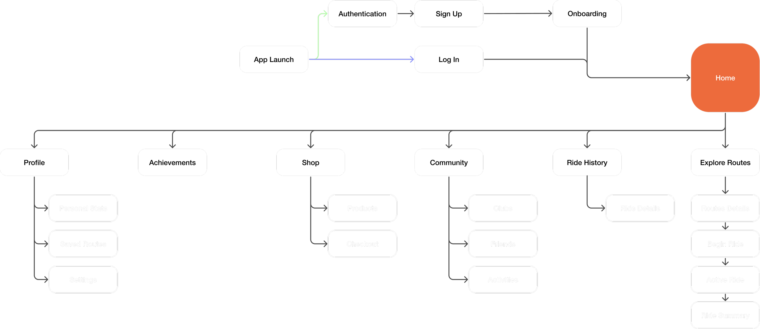
SITE MAP
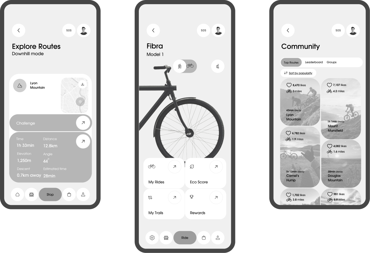
Fibra is designed as a bike companion app that supports the ride before, during, and after it happens. I translated the design principles into a sitemap centered on selecting a route, beginning a ride, and sustaining engagement through history, community, and progress.
USER FLOW
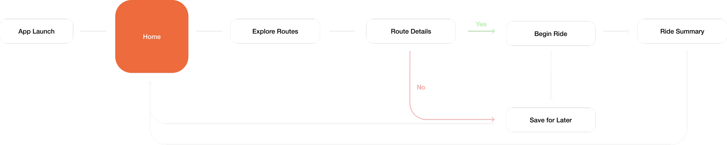
This task flow isolates the decision point between exploring a route and beginning a ride. Because hesitation occurs before the activity starts, I focused on supporting decision-making at the “Route Details” stage. A “Save for Later” path reflects real behavior, allowing riders to pause without losing context and return easily. Together, these paths create a repeatable loop that builds confidence and supports continued outdoor use.
MID-FIDELITY WIREFRAMES
HIGH-FIDELITY WIREFRAMES & IMPLEMENTATION
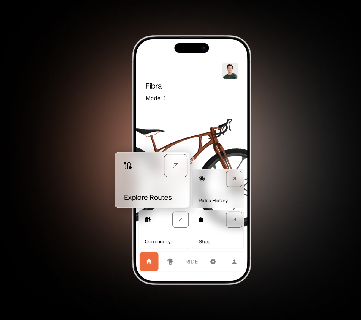
Freedom to begin riding without forced decisions
Direct entry to key ride actions
No performance metrics on the home screen
Start ride without selecting a route
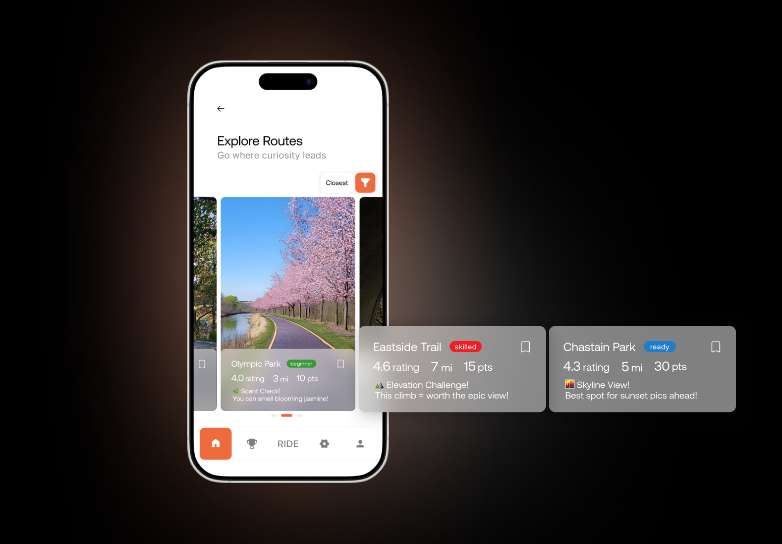
Route details shown before starting
Distance, elevation, and difficulty visible upfront
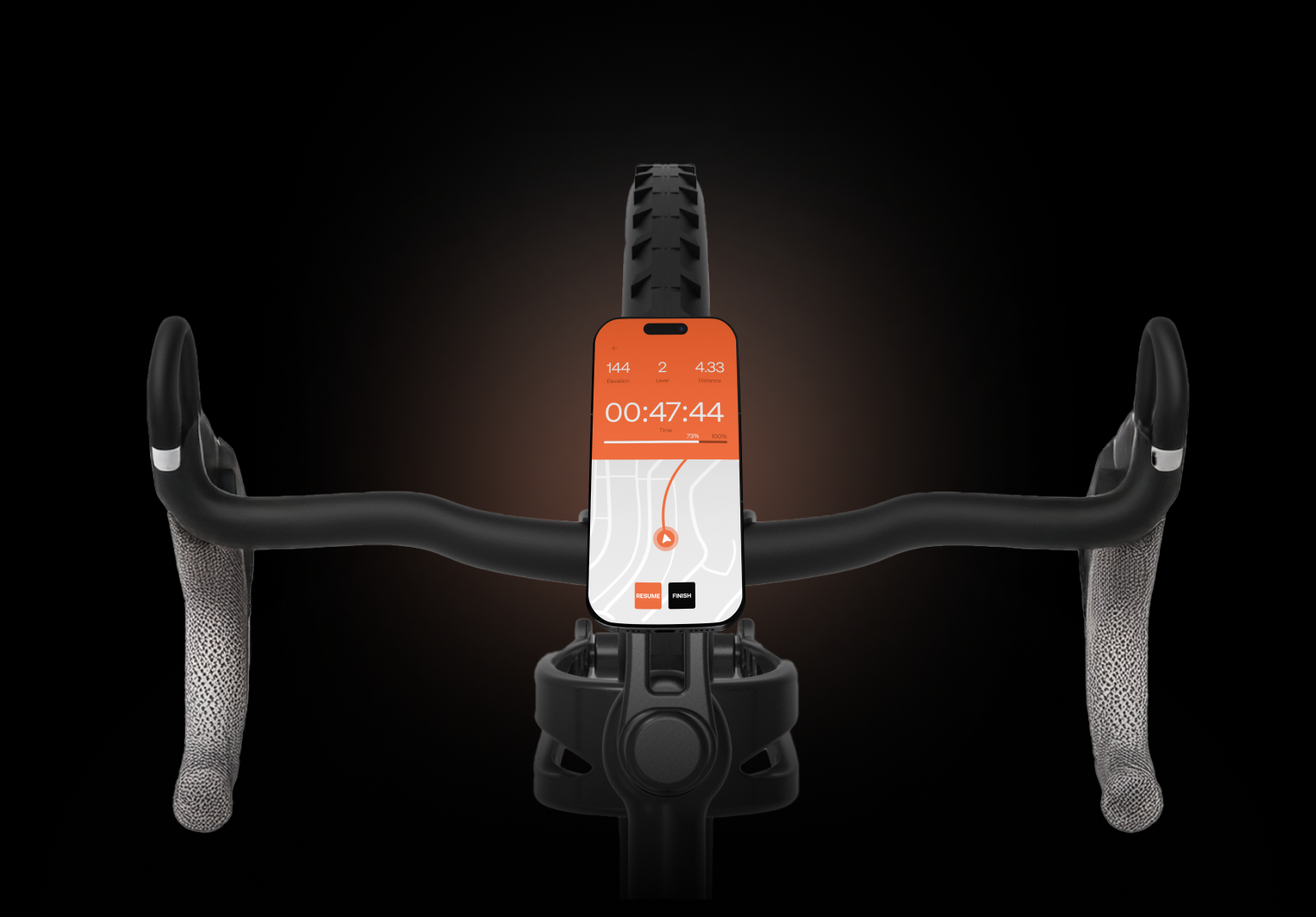
Clear metrics during navigation
Riders refocus on the road ahead
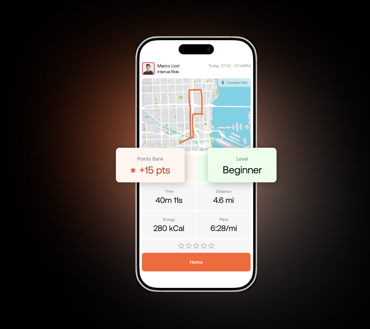
Clear progress that supports continued riding
Visible progress and points create motivation to return
OUTCOMES
After refining the high-fidelity interface and implementing the core ride flow, I validated the experience through usability testing with eight participants across different skill levels. The results showed that simplifying preparation enabled independent ride initiation and successful completion of the full ride cycle.
IMPACT
Behavioral change toward sustained outdoor activity emerged through a credible mechanism for sustained outdoor habit formation.
LEARNINGS
✅ Design clarity comes from real user needs
I had to catch myself making assumptions and turn them into real questions.
That shift helped me design from what riders actually needed, not what I thought they needed.
✅ Strong products require shared alignment
The bike and the app were designed in parallel. Staying in constant conversation helped us keep one clear direction and one shared visual language across both.
⏩If I had more time
I would run a second round of usability testing with a larger group – both in person and remotely – to validate the experience and refine the final details.