
Erewhon: Usability Testing Self Order Experience
A research-based usability study to evaluate Erewhon’s newly developed kiosk system. Focused on user interaction, ergonomics, and task clarity, the testing provided insight into how the experience supports Erewhon’s premium service standards and aligns with the expectations of its customers.
Role
Usability Tester & Researcher
Date & Duration
2024, made in 10 weeks
Type
Individual
Client
Erewhon

As luxury retail environments adopt self-service technology, the shift raises questions about how these tools integrate into curated, high-touch experiences. Erewhon, exploring its first kiosk system for their juice bar, sought to understand whether this new layer of interaction could reduce wait times while maintaining the sense of intentionality, comfort, and attentiveness central to its brand.
Problem
Solution
This usability study examined Erewhon’s emerging kiosk system through the lens of user behavior, flow efficiency, and in-store context. Rooted in observation and insight, the research supports experience decisions that balance convenience with the store’s commitment to calm, considered service.
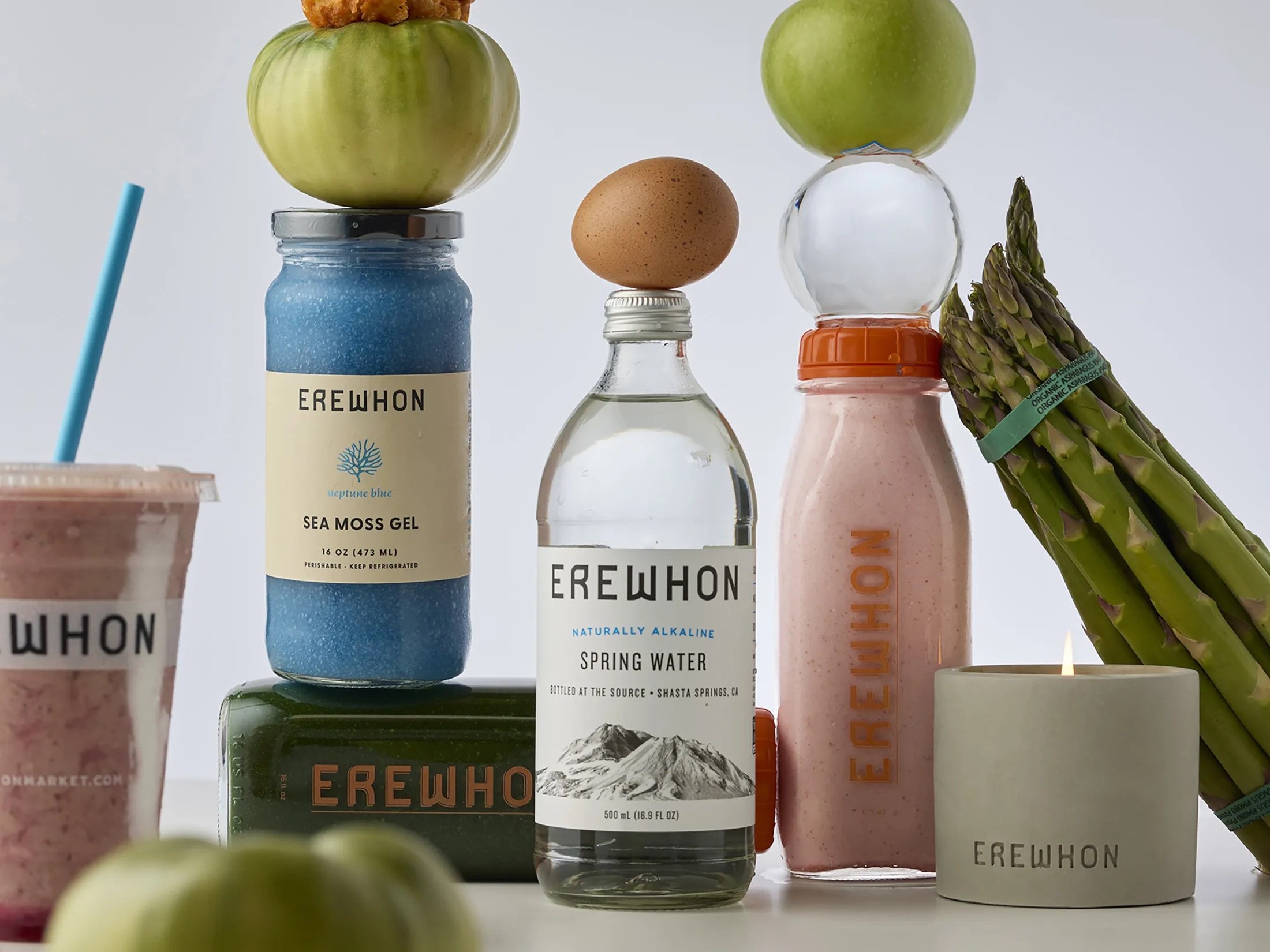
Brand Context
Erewhon offers a high-end grocery experience with a focus on quality, service, and curated product selection.
Premium Retail Environment
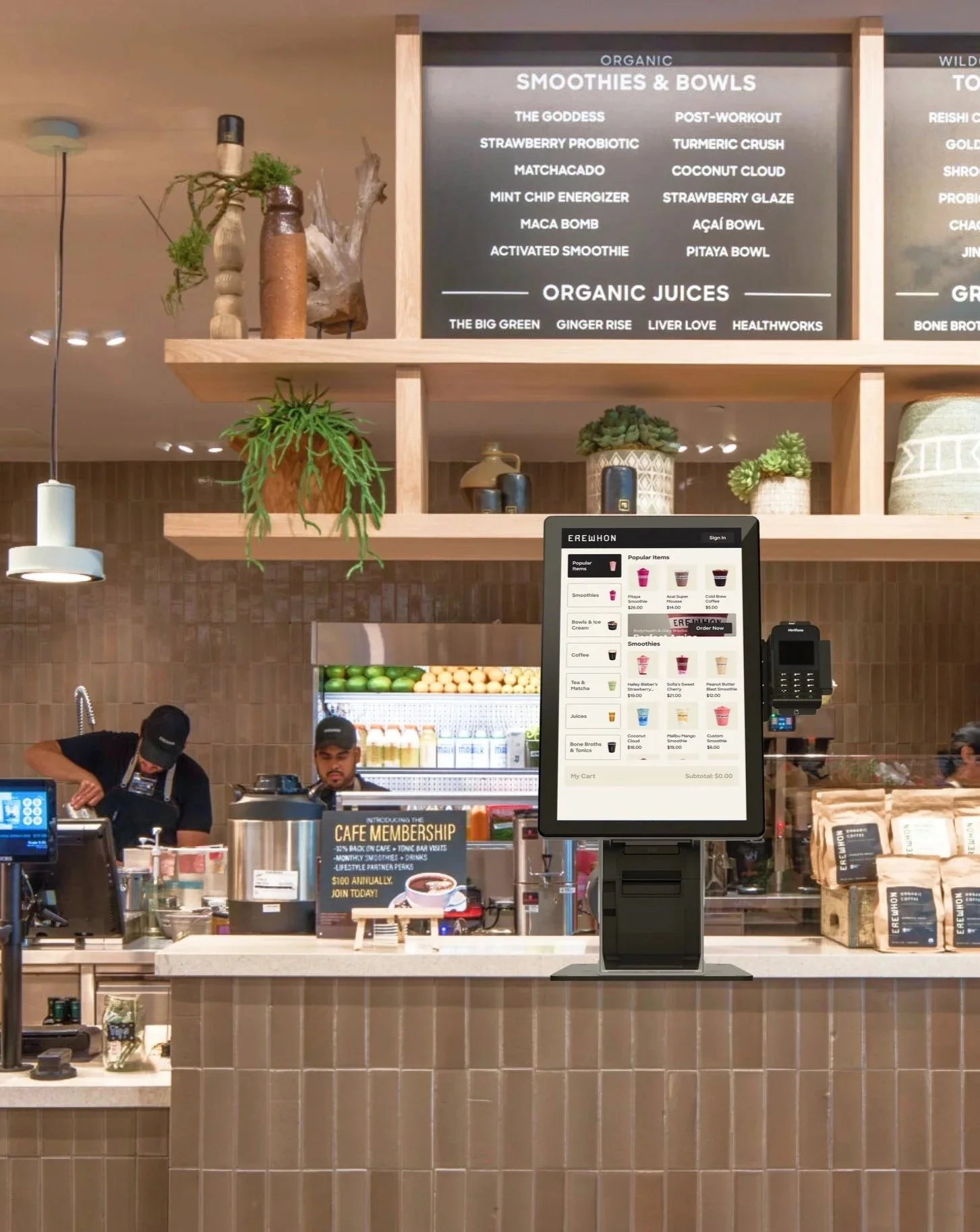
The kiosk was Erewhon’s first step toward self-service, aimed at reducing wait times while maintaining a consistent in-store experience.
New Juice Bar Self-Checkout System
The kiosk needed to meet usability and accessibility standards without disrupting the store’s atmosphere or customer expectations.
Usability Expectations

Process
Working with kiosk touchscreens felt especially relevant to me, as they are becoming just as common and influential as mobile and web interfaces. What matters here is not only the kiosk itself, but the physical space it lives in. Seeing how people move, stand, wait, and interact around it is just as important as what happens on the screen. Having hands-on experience in this context felt very aligned with where the market is today.
The scope of this project focused on evaluating Erewhon’s first self-order and checkout kiosk using an existing UI designed by another team. My role was centered on research, usability testing, ergonomics testing, and post-testing UI recommendations. I started with competitive analysis and first-hand exploration of self-checkout kiosks across different use cases. Testing them myself made certain things immediately obvious. Some ideas were clearly misaligned and got eliminated early because I knew they would not work in real conditions.
During testing, I looked beyond task completion alone. I paid close attention to reaction times, posture shifts, moments when participants leaned in, narrowed their eyes, or hesitated after tapping an element. These details often spoke louder than success rates. Post-click reactions were especially telling. They were natural, unfiltered, and revealed user expectations instantly. From a solutions standpoint, one of the biggest realizations was that they don’t have to be complex. Small adjustments, like element opacity or placement, can significantly change how confident and clear the experience feels.
Another key takeaway was understanding that users do not perceive interfaces in isolated parts. They absorb the experience as a whole. Every element contributes to a single impression, whether intentionally designed or not. Seeing this reinforced how important cohesion is, not just clarity at the component level. Overall, this project strengthened my belief in usability testing as a high-impact discipline. When done well, it removes guesswork, prevents avoidable mistakes, and saves time and resources for the business.
Ergonomic Testing: Kiosk & Card Reader
Tested with 14 participants (height range: 4'11"–6'2")

50in height, 10 degrees angle
Kiosk Configuration 1:
34%

52in height, 15 degrees angle
Kiosk Configuration 2:
38%

54in height, 20 degrees angle
Kiosk Configuration 3:
28%

48in height, on the right of the screen
Card Reader Configuration 1:
33%

48in height, on the right in front of the screen
Card Reader Configuration 2:
28%

44in height, under the screen
Card Reader Configuration 3:
39%
Prototype: Usability Testing Setup
Age: 28–38
Urban-based, health-conscious lifestyle
Disposable income, primarily female
Not full-time employed
BFA+ education
Tech-comfortable but design-sensitive
Test usability of screen and card reader positions
Goal
Participant Profile
In Person

Simulated Erewhon kiosk and store environment
UX testing room staged with real interactions
Live kiosk prototype with actors playing baristas and customers
Remote
Figma prototype walkthrough via TeamViewer
Unmoderated Maze tests
Prototype :Usability Testing
Tested with 18 participants (13 in-person, 5 remote)
Goal
Evaluate whether users can successfully navigate the kiosk to find and customize items, understand menu structure, complete checkout, use loyalty points, and confirm order readiness expectations.
Item discovery
Order customization
Menu navigation (left-to-right panel relationship)
Cart management (add/remove)
Loyalty point redemption
Checkout (member and guest)
Order readiness confirmation (SMS expectations)
Flows tested:
Results:
79/100%
Successfully found requested items.
97/100%
Successfully used the “Quick Add” feature.
62/100%
Successfully removed items from the cart.
51/100%
Successfully customized smoothies.
28/100%
Successfully added coffee modifiers.
59/100%
Successfully applied loyalty points at checkout.
55/100%
Successfully added smoothies to cart.
86/100% & 92/100%
Expected SMS notification for order readiness.
24/100%
Didn’t realize a coffee size requirement.
Insights & Solutions
Navigation Clarity
50/100%
Had difficulty understanding visual separation between subcategories.

Sticky headers
Subcategory strokes
Search bar
Solutions:
58/100%
Cart management
Expected to remove items within the same product module it was added.

Solutions:
Introduced quick-remove buttons directly in the product module
Smoothie customization
43/100%
Stated low visibility of the “customize” button.
58/100%

Repositioned “Customize” button
Embedded customization within the ingredients list
Solutions:
Expected to add ingredients in the “ingredients” list.
Coffee modifiers
Experienced difficulties finding requested coffee modifiers.
72/100%

Dropdown categories
Tabs
Clarified labeling
Solutions: